
One of the most rewarding aspects of our work is seeing how our lighting & décor designs contribute to impactful interior spaces, but what does "impact" in interior design really mean and how do we curate it?
From our experience working with hundreds of designers and thousands of customers is that impact is an ephemeral concept that influences emotions, functionality and atmosphere but it also has an important capacity to be memorable, to affect mood/wellbeing, to influence behaviour and beyond.
Why is this important?
We're approaching this guide from both a residential and commercial outlook.
For domestic spaces, impact can be both a wow factor for friends when entertaining but also our homes are where we exist for a large proportion of our time and therefore has the greatest potential impact on us.
When we consider commercial factors, impact is increasingly crucial when designing spaces to give customers or staff the best possible experience, encouraging repeat visits and showcasing personality.
In this article we'll explore some general principles of impactful design elements as well as some tailored guidance for specific types of spaces, with the aim to give you some extra tools to influence impact in your designs.
Impactful design elements
Let’s revisit the core elements of interior design: colour, texture, space, height, depth, brightness, materials and more. Each of these play a role to create impact. For example, a jazzy wallpaper here, a double or triple height ceiling there and dramatic light fitting above, are always going to grab attention. Here are three general concepts to get you thinking about how to make a space feel impactful.


Scale and frequency
The proportions of a space help us understand what fits, but also what we can visually digest. Say we're thinking about adding a biophilic element; one plant in warehouse will do nothing, 100 plants in a small room will transform it into a jungle.
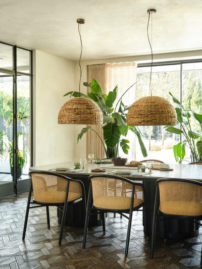
The larger the space, sometimes the more challenging it is to make an impact. However, it does become easier to leverage negative space. A large, bare ceiling could be calling for a huge blanket of pendants, alternatively, the same impact might be achieved from a smaller number of larger pieces that match the proportions of a setting, allowing the rest of the area to breathe. Both approaches are valid.


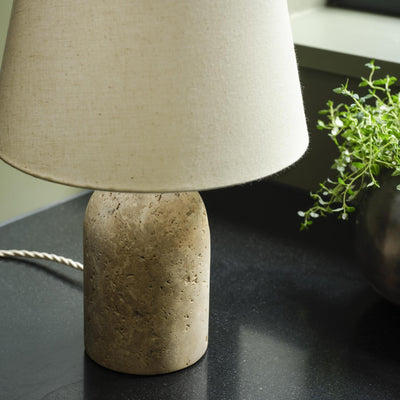
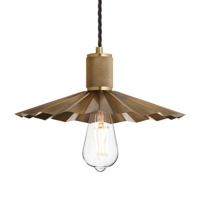
Left: Knurled Pleated Slope Pendant Light & Auburn Wooden Counter Height Stool.
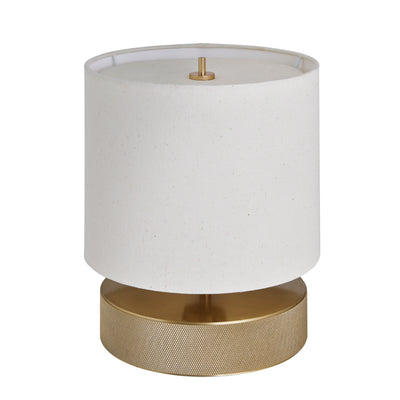
Right: Alabaster Dual Lit Table Lamp, & Laurel Wool Pouffe.
Pattern and texture
Visual art schemes are the first design element to guide the eye when we walk in a room, it’s all about balance. Imagine a feature wall with a bold pattern balanced against more calming solid colours, this maintains an intimate ambience whilst making the space feel alive and personal.
Texture engages our sense of touch for a more immediate impact than patterns. Natural materials like wood and cotton create a calming, grounded atmosphere, while synthetic elements like glass and metal add a sleek, modern edge.


Colour and colour theory
Colour is one of the most psychologically resonant tools in interior design. It shapes perception, behaviour, and emotion, often subconsciously. While it’s easy to think of colour in terms of personal preference, its impact is both universal and nuanced—backed by a depth of research across environmental psychology and design theory.
Rather than simply identifying colours as “warm” or “cool,” it’s more useful to think about how colour temperature, saturation, and contrast interact with light, space, and function. In essence, colour supports mood regulation, enhances spatial awareness, and influences how long people want to remain in a space—crucial in both residential and commercial settings.

Moonj Natural Grass Wall Light
A Quick Guide to Colour & Emotional Impact
| Colour | Associated Impact |
|---|---|
| Blue | Promotes calm, trust, and mental clarity. Often used in spaces designed for focus, rest, or communication. |
| Green | Evokes balance and harmony; connected to biophilia and nature. Ideal for wellbeing-centred environments. |
| Red | Stimulates energy, urgency, and appetite. Best used in moderation or as an accent to avoid overwhelming. |
| Yellow | Uplifting and energising; associated with optimism and warmth. Works well in social or creative areas. |
| Orange | Conveys enthusiasm and vibrancy. Often used to encourage interaction and movement. |
| Purple | Often tied to creativity and luxury; deeper purples add depth, while softer hues introduce tranquillity. |
| Neutrals (white, beige, grey) | Create openness and versatility; foundational in layered designs and often used to reflect light and balance contrast. |
| Black | Used sparingly, it adds depth, sophistication, and grounding contrast. Effective in defining focal points. |
Colour washing and blocking have become go-to techniques for adding character to a space. Colour washing creates a soft, seamless look by using the same shade across walls, ceilings, and even woodwork—it wraps the room in a gentle, cohesive tone that feels calming and considered.
Colour blocking is the opposite: it’s bold and graphic, using strong, contrasting colours to make a statement or define different zones within a space. Both are simple ways to play with colour in a more design-led, impactful way.

Residential Spaces
In our homes, impact will always wow your friends, but more importantly, the deeper effects are felt by those of us who live and breathe these spaces. The way a room is designed, with colour, texture, and general layout, all work together to shape our daily experiences.
The subtle choices we make, like incorporating calming tones in a bedroom or energising accents in a workspace, affect how we interact with our environment and with ourselves.


Left: Boston Round Metal Diffuser Wall Light
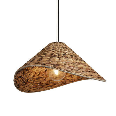
Right: Sea Grass Giant Dome Pendant Light
Contrast
Contrast plays a key role to create spaces that are dynamic and full of life. Mixing different shapes, colours, and textures doesn’t just add depth; it elevates the sensory experience, encouraging interaction with the space in more meaningful ways.
Whether your mixing soft, plush fabrics with sleek, metallic finishes, or pairing bold, vibrant colours with subtle neutrals, contrast adds visual interest and energy. It’s about stimulating the senses, adding layers to your space and inviting you to explore and engage.

Focal points
Every room deserves a focal point. Whether it’s a bold statement piece like an ornate chandelier or a striking work of art, these features give purpose to a space. They create visual interest, stir emotion, draw people in and inspire, it’s about design that feels intentional and thoughtfully curated.
Personalisation
Personalisation is the heart of any meaningful interior, giving a room memories, stories, and personally significant touches. Think family heirlooms, travel mementos and unforgettable photos.
This level of personal investment creates an emotional bond with your home, making every corner of your space feel like a reflection of identity and a place of true belonging.

Brooklyn Umbrella Wall Light (Image courtesy of @six_by_the_sea)
Commercial Spaces
When we consider commercial factors, impact is crucial to showcase personality and keep customers coming back for more, looking to recreate those memorable experiences. Additionally, creating spaces where staff feel comfortable and energised will have a positive knock-on effect across the business.
Thoughtful design that nurtures well-being uplifts mood and energy, helping staff feel motivated and valued. Whether it's striking visual elements, or thoughtful design that tells a brand story, the right impact means people don’t just visit, they remember.

Flume Pendant Light - 17 Inch & Flume Diffuser Wall Light - 12 Inch.
Brand alignment
Thoughtful design ensures that the space doesn’t just function well but embodies the essence of your business. The impact here goes beyond aesthetics—your design elements should reinforce the brand story and mission. When design aligns with your brand, customer and staff alike can build trust and form a genuine connection with your business on a personal level.

Orlando Cylinder Wall Light (Image courtesy of @tmlcreative)
First impressions
First impressions are everything, especially in interior design, and your shopfront is the first opportunity to generate an instant impact and engage potential customers. Attract attention to specific features with accent lighting, or create a real atmosphere with ambient lighting. This is the perfect gateway to set the tone for what’s to come and builds expectation. Just like our first principle, this is also an introduction to your brand’s personality, style, and values. Use window displays or artwork to set the scene and create a visual story.

Brooklyn Opal Glass Dome Flush Mount | Albany Wall Light | Albany Double Pendant (Image courtesy of Poppy Jakes Photography)
Instagrammable interior design
In today's digital age, a well designed space can be a great tool for organic marketing. People love to showcase their experiences and if your space stands out, this is the perfect chance to generate buzz online. Enhance brand visibility and your reputation, providing unforgettable experiences to help your business stand out in a crowded market.


Conclusion
As you can probably tell, we’re all about creating impact, and that passion really shines through in our latest collections. The 9 principles we’ve shared will make your spaces stand out, but there’s one key ingredient that ties it all together, and it all comes back to thoughtful design elements.
It’s these carefully chosen pieces that bring that extra level of impact and really complete your look. Take a look at our newest collection which does just that.


